Phil Starke Studio Newsletter - May 2020
Phil Starke is a professional fine artist with prestigious gallery representation, participates in national museum exhibitions, and teaches workshops and online fine art courses.

PHIL STARKE STUDIO NEWSLETTER
May 2020

Things are finally drying up here in Georgia, we’ve had such a wet winter I was starting to give up on painting sunlight again. I have several Georgia spring paintings in the works and I’m out looking for early summer subjects. Below are several of the paintings I’ve finished up this April.

Click to enlarge

Click to enlarge

Click to enlarge

Click to enlarge
Settler’s West Gallery in Tucson had a successful Summer Show, despite no one being able to attend. Everything was handled online.
I sold “Cottonwoods Near Hillsboro” a 30x30, always grateful when a painting sells. Thanks Settler's West Gallery for all you do for your artists!

Click to enlarge

Click to enlarge
In the Easel Insight Membership lesson this week I taught about “Using Thin and Thick Paint”.
In a demonstration, I showed how important the contrast of thin paint against thick paint is in suggesting strong light and giving your painting a sense of depth. For more information on Easel Insight Membership click here: https://www.easelinsight.com
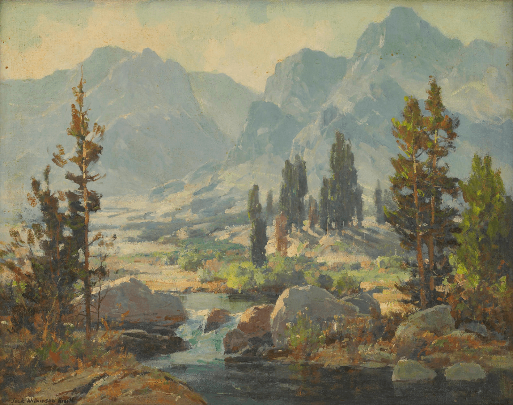
ARTIST AT A GLANCE
Conrad Schwiering (1916-1986)

Conrad was born in Boulder, Colorado in 1916 and attended the Art Students League of New York in 1941. After serving in the army during World War II he moved to Jackson Hole Wyoming and opened up a gallery. He painted the Teton area and often painted large paintings outside. His painting style is very loose and he could really suggest his subject without getting too detailed.
Conrad exhibited in the Prix of the West show at the Western Heritage Museum, the Gilcrease Museum and was a founding member of the National Academy of Western Art.
- IMAGE 1
- IMAGE 2
- IMAGE 3
- IMAGE 4
- Image 5
- Image 6
- Image 7
- Image 8
- Image 9
- Image 10
- Image 11
- Image 12


Click to enlarge
ARTIST TIP
“Understanding Color Intensity”
As artists, we know how hard it is to understand color. It’s like nailing jello to the wall, everybody sees color differently. Even though color is subjective and we respond to it differently there are important aspects about color we have to understand and experience. One of them is understanding color intensity. How strong should we make our color?
One thing that will help is to do color studies with muted colors and saturated (intense) color. It helps to experience using both pure colors (colors that are more primary like cadmium yellow, cadmium red, Alizarin crimson, Ultramarine blue) and earth colors or muted colors (yellow ochre, burnt sienna, raw umber, ivory black).
Here is a good exercise to get a feel for muted and pure colors: Take one photo and do 2 small paintings (6x8, 8x10). In one study use a pure palette and on the other painting use a muted or earth palette. In the 2 paintings below I used a pure palette of cad. yellow light, alizarin crimson and ultramarine blue, and you can see the colors are more intense. On the second painting I used earth colors, yellow ochre, burnt sienna and ivory black. It is interesting to see the black look like blue when put it into this context. The second painting is more muted and harmonious, but both suggest the light that was in the reference, the difference is the intensity of the colors. Both palettes appeal to me and I use them both at different times.

Click to enlarge
Have you signed up to get my free Newsletter?
Don't miss out on all my great content!
If you have friends who would enjoy this newsletter, please share. Thank you!
EDUCATIONAL RESOURCES
PAINT WITH CONFIDENCE FAMILY OF ONLINE COURSES


DOWNLOADS - WORKSHOPS - RESOURCE LIBRARY


these are beautiful paintings Phil
Thanks Nancy, I’m enjoying painting Georgia.
Very nice newsletter.
RH
Thanks Rosemary. Glad you enjoyed it.
Love your work, & advice!
Thanks so much Susie!
Beautiful Paintings. A great lesson on painting with a primary palette or muted one.
Thanks Beatrice. Glad you enjoyed the newsletter.